Diary of a Camera
Tuesday 7 April 2015
Final shoot
After conducting my final shoot with the boys I realised that the lighting was off. Instead of the background being white, it came out yellow. This could have been due to the softboxes over the top of the lights. I will still work with these and just change the lighting post-production in photoshop.
I feel as though each person needs an explanation to the object they chose to bring with them.
Joe brought along a picture of his dog Charlie. Since the object he chose is something that makes him happy I had him talk about happy memories he had with Charlie. I managed to get some pictures of him smiling and laughing.
Ed brought along two things to let me choose. The first was his box of pencils because he loves to draw. The second object (which I chose to shoot him with).
Was a gift from his dad, the last thing that his dad gave to him when he was 8 before he left. Due to the delicate nature of the object I spent more time talking to Ed about it. I had him on the floor and he looks sad in a lot of the photos. His story was heartbreaking to hear.
Ladi brought along a book. The book was something he associates with a very specific memory. He found it in a very hidden bookshop when he was walking through London. He brought the object because the memory associated with it makes him happy. The shot I like best is one where he is gazing down at the book with a very thoughtful expression. I like the idea that the book takes him to a happy place.
Friday 27 March 2015
Cultural Imaginaries & Landscape
Landcapes were the unsung heroes of photography for a while. They were simply used to fill in the negative space around the subject of the photograph. As art evolved, so did photography. Landscapes became a subject in their own right. Landscapes show us the world that we live in, they are used to show the beauty or horror of the world around us. Peter Lik is a photographer who focusses heavily in the unseen beauty of landcapes.
By using filters over the lens of his camera he captures stunning landscapes all over the world, never featuring human interaction in his photographs.
Cultural Imagineries is a relatively hard concept to understand. The best way to understand it is by picturing a migrant community in a city, let's say New York. The migrant community are in a location that is not their own, but they create their own culture. This culture is neither here nor there. It does not exist in a place, rather, it exists wherever the community goes. It is an imaginary culture.
Professor Hector Perla (University of California - Santa Cruz) describes the Latin American identity as an imagined community, one that is “socially constructed through narratives, myths of origins, symbols, rituals, and collective memory…imagined by people who see themselves as part of that group…”
Cultural Imaginaries can also be used to describe the production, identification, and reproduction of a culture. In terms of photography it could be argued that photographs contain Cultural Imaginaries as the culture is not really there. It is in the photograph.
Tuesday 17 March 2015
Testing, Testing
I DID MY FIRST TEST SHOOT
I tried to make it informal to try to get the boys to feel comfortable in front of the camera. I figured out how to sync the studio lights to my camera, so I was having a bit of a play around with them. There's still work to be done but that's what a test shoot is for! For my final shoot I'm using three boys, two photos of each person. In the first picture, each of them will be in their rugby uniform holding a ball (to show the stereotype).
In the second photo they will be holding something that they feel defines them. They will be in their own clothes and I'm going to try to capture some real emotion.
I like this photo because if the lighting, it's fairly soft, mattifies the skin. The background it lightest around the focal point and darkens slightly at the edges. It means that your eye knows there to look because of where the lightest part is. I don't like the shadow in the background, but that can be taken out in post production on photoshop.
Same again as with the photo above, the lighting is good but I don't like the shadow, also the floor on the infinity screen has scuff marks on it. Maybe by putting more light focussed on the floor, the scuffs won't be obvious?
He was standing in the sort of position that I'd want for the first photograph. Fairly standard sports pose, emphasises body shape and muscle.
Natural emotion can be seen here. The lighting is by far one of the worst, but Joe started to relax into it here. I plan on bringing music to the next shoot so that people feel less pressure. It's these sorts of moments that I want to capture.
Again, the boys started to relax a but more. They sat down and started chatting. I did direct them in this picture on where to look, so although it isn't a completely natural photograph, I can see that be boys are more relaxed here. Even though I wont have shots with multiple people in them, this is a good example to show body language.
They started messing around more here, interacting a lot more comfortably ion front of the camera. Pulling faces at each other when they were standing on the infinity screen. The lighting here is a little funny because one side of it is yellow and the other side is white. I think the lights didn't flash here
Last photo, also a good example of the "sports shot". Straight faces is what I think I need for the initial photo. Potential to have each person doing the same pose in the first shot to show how all the people form the team have the same sort of stereotype on them.
Tuesday 10 March 2015
Databending
Every picture is made out of coding
Not quite the easy to read HTML that a lot of people know, bur coding nonetheless.
If you change the codes slightly, the picture changes.
The thing about databending is that unless you know the coding format, the outcome of the picture can't be predicted. Taking out a few lines might change the hue of the picture or could completely flip it. Here are my experiments below.
I like how staggered this photo is. It sort of looks like it could be made up of multiple photos all chopped together. It seems that repeating the coding over and over staggers strips of the photos.
This picture could easily have been done on photos. Here, the levels in the photograph have been changed so it looks a little faded. I like this one because it's a soft picture
I like the purple toning in this photo. It graduates getting to a stronger purple down the picture.
I like the second strip in this picture because of the lomography effect that it gives. The frustrating thing about databending is that the effects are near impossible to replicate.
Even though this picture is dark, it's a good example of how databending can change the tones of a picture.
This picture is my favourite. It's a crazy colour, and is broken up in a way that i like. The strips vary in size a lot.
Monday 9 March 2015
Flashy
FLASHGUNS are now my new favourite thing.
I bought one a few years ago for my own camera but they never really taught me how to use it properly.
This most recent session was my favourite for sure.
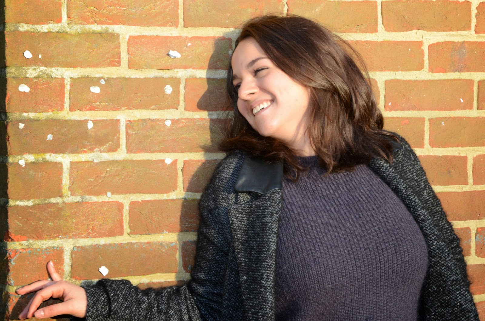
We experimented with different lighting environments and how the flash worked with it. When outside, using the flash seemed somewhat redundant initially. However, using the diffuser with the flashgun outside made Lucie's skin seem to glow and look flawless. Using the flashgun in the studio gave a very truthful look, bringing out the true skin colours.
The above photographs were all taken around the same area. Knowing that faces are more clear with the light shining into them I places Lucie so that she was facing into the sun. The most visible difference between the top three pictures and the bottom two is the texture of her skin. The top two were taken without the softbox cap, which meant that the flash reflected off her skin, making it look more shiny.
For the above photographs we changed location, I moved Lucie to the loading bay to try to experiment with different sorts of light. The loading bay is in a fairly dark area so I had to play around with the f-stop. Again with these pictures, you can tell where we used the softbox cap as her skin becomes matte.
These pictures were taken on the infinity curve of the studio. Because of where the flash concentrates, the edges of any picture taken on the plain background are always a bit darker than the centre.
I'm doing a test shoot with some people on Tuesday for my final idea. Hopefully it will help me to clarify how I want the final 6 photographs to look and how many participants I want.
Tuesday 3 March 2015
There's a Storm in my Brain
.... Brainstorming
I've been trying to come up with ideas of what to do for my final project. The brief says "Produce a series of 6 to 8 digital photographs that investigate ideas of representation and identity of a cultural, social or political place (i.e an individual, a community, a location etc.)
So
Here is my idea...
I want to look at redefining stereotypes. The idea is still only in the development stage, i have a few different possibilities of what I could do. I thought about taking activities out of context, e.g. have the rugby team in the library, have a dancer in a science lab, have someone out at a desk, have someone meditating in the middle of a restaurant etc etc.
One artist relating to this is Dane Shitagi, who has an ongoing series called "The Ballerina Project", she takes the dancers out of their usual spaces and context.
I do like the rest of the pictures, but they are very posed, theres very little spontaneity about these pictures. Something that I would have done rather than pose them in specific ways would have been to make them dance around the objects so that they relaxed into the motion.
I also thought about maybe looking at a specific team and taking it apart. Showing that within the one entity of a sports team, they all have individual quirks.
Sunday 22 February 2015
Strangers
Strangers...
Strangers are scary intimidating, naturally, because you've never met them. You don't know how they'll react to questions.
This weeks task was to go out into Brighton and talk to shopkeepers. The task was essentially to try to get us used to talking to strangers and taking photos of strangers. Quite the challenge I can say that much. Most were happy for you to take pictures of their shops but not of them. I only managed to find 2 people who were happy for me to take photos of them.Brighton Jewels
The guy who runs this store was more than happy for me to take photographs of him and his stall so long as he could just carry on doing what he wanted. It seemed that me taking photos of him prevented people from going up and talking to him because whilst I was there, no one came up to him. Having a camera seems to intimidate some people.
This set of pictures was fairly hard to take as it was such a bright day. Although this does mean that the photos taken fully in the sun look striking as the sun bounces off the reflective surfaces, the shadows cast by the sun were quite severe, and required a fair amount of editing in order to be able to see everything the way I wanted.
Snoopers Attic
Snoopers Attic is one of my favourite places to go. It's full of kitsch little trinkets and they're all so beautiful. The people working in there when I went in were a mother and daughter pair. Pictures of them were off the cards completely. So instead I was left wondering around taking pictures of things in their store. Beautiful as they are, the lighting wasn't great so most of the pictures came out a bit too dark or blurry.
Snoopers Attic had a lot of interesting trinkets to take pictures of, and the light was really nice in there (which is why I kept the pictures). But that fact that the people working there were so unwilling to let me take pictures of them, it put me off a fair bit. I felt like if they got into any of the pictures accidentally, that I was intruding their privacy.
Artemis Sheepskin
Well, where do I even start?
The owner of Artemis is called Melissa, in true Brighton style she was eccentric and brilliant. More than happy to let me take photos of her and her shop, and even pose her!
Artemis is a shop that supports artisans. All the skins are sourced from one family in the Carpathian Mountains and all hand made, and BOY are the slippers soft.
Here are some of my favourite shots from the time I spent in her shop. She said I'm welcome back any time!
Artemis stocked a lot of the same products as snoopers attic, just in a smaller space. The glass and reflective surfaces were fun to take pictures of as they defract the light. Particularly the chandelier. The textures of the different fabrics and furs look great as well because the pictures I have on here are so clear. In reality, a lot of the pictures came out just a tiny bit blurry, although the blur couldn't be seen on the camera screen.
Subscribe to:
Posts (Atom)